

iancoxleigh
-
Posts
3,401 -
Joined
-
Last visited
Content Type
Profiles
Forums
Blogs
Events
Downloads
Gallery
Store
Image Comments posted by iancoxleigh
-
-

All comments welcome. This is an old(er) photo that I had relegated to
my maybe folder for the last few months. A new crop and a fresh
perspective have made me reconsider its merits. As such, and
suggestion or comment is more than welcome.
-
Thanks a lot guys. I've been sitting on this for quite a while never quite sure of it. Something about the angles of the building continue to irk me. But, the square crop has made this more certain in my mind. Maybe I ought to put this one out for critiques?
-

This is still lovely, and the stars might even be better, but, for what its worth, I prefer the comp you posted to NPN. It has a lovely receding line in the foreground that helps draw me into the scene. This thrusts me up into the sky more quickly and diminishes the role the foreground plays in the whole composition. As much as that sounds like it would be a good thing here, it isn't. I simply am less engaged by this version overall and turn away from it more quickly.
For some reason I also prefer the halo more centred within the frame, but, that is liable to be a matter entirely of personal preference.
-
 Very nice. I like all the layers here and the overall presentation that takes advantage of it.
 -
 The soft light on the sand and the earth shadow are both very pretty. I find the sky to be dark without much purpose or effect. I think the darkness hurts the gentility generated by all the softness and pastel tones of the foreground. I also think the moon looks fake (whether it is or not). Cropping the top down to almost a 4x5 ratio seems a good option to me – or some other technique to mitigate the issues I find with the top.
 -
Nice. I like such dense scenes and you have managed to find a pleasing natural harmony here. Very good work, indeed.
-
WOW! What a sweeping and inspiring view. Lovely.
-
I like the composition and the framing. But, I find the colours hard to take and over the top with saturation – my problem being that they do not work with the mood that I feel the rest of the image has. The tree looks oddly brightened too.
-

I basically agree with Marek. This is very nice indeed and I like the softness of both contrast and colour here – it is different than many shots of this icon. The grasses are a nice touch as well. I might wish them either have been full stopped or more motion-blurred. I am not fully sold on the mid-way partially blurred form they have here.
I also note that your image appears a touch tilted. I know the opposing shore is receding and that will affect the perception, but, if you create a horizon line by splitting the distance between the reflections and the mountain, you can still see this is tilted CW.
-
Very elegant Paolo. Nice. I like the diffuse horizon.
-

I really like your original crop. It has a grace to it and a majestic openness.
Lovely image all around. I love how the huge trees and massive amounts of snow dwarf the plow. The soft colours against the punchy yellow also works well.
-

Absolutely excellent!
I don't know how many photos of this I've seen, but if it is one, it is one-hundred. However, yours manages to be just different enough. The water spilling out of the crack and rushing at the surface adds such a different quality and make for a dynamic composition. I also like how dark you left this – especially across the top.
Great work.
-
 Great! What a fun shot. I especially like the other colours here. The central man's green backpack, in particular.
 -
Yes, it is true, I probably understand you better now. I can certainly see why you would want to pay homage to Cezanne and share your desire that everyone become more familiar with his works. His paintings – especially those made late in his life when he lived in Provence are such an important part of art history. They are the bridge between the impressionist and post-impressionist worlds and the modernity of Picasso and Braque and others to follow. The foundations of all that are with Cezanne and he is under appreciated compared either to his predecessors or his followers when he did so much of the exploratory work of finding a way forward.
I certainly enjoyed our discussion. Thanks.
P.S. I certainly know of no other accepted spelling than homage. I simply made an error. Moreover, you are correct that there is nothing in homage that expressly suggests that there should be anything more than an offer respect and admiration.
-
Hi Pnina,
Sorry not to get back here sooner.
I think I understand what you mean by hommage. In all of the other images you provided with your reply (and their subsequent discussions), I can really see why the association came to you or why you felt a given image had an element of hommage within it.
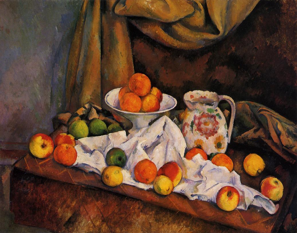
I did not expect your image to be directly analogous to Cezanne's. However, I still don't really see here what made you think of Cezanne here. Other than the fruit and the table, I do not see anything that relates in my mind with Cezanne's images.
I feel the mood is very different. His are full of energy and motion – occasionally even frenzied. Here it is calming, soothing.
I feel the technical aspects are different as well. Your image has a much fuller, deeper perspective with a long background that extends deep beyond the immediate scene than any of his very fore-shortened perspectives. Your image's composition seems at rest, while so many of his seem precarious, or even in motion due to his treatment of the brush-strokes on the canvas.
Do not get me wrong, I quite like this image. I also like the series as a whole so far and I feel this image fits very nicely with the others you have made.
If I was to point to an image that I felt had a great deal of similarity with this, I would turn to one of Gaugin's still-life images from his time in the south-Pacific.
http://www.paul-gauguin.net/Still-Life-With-Teapot-And-Fruit.jpg
For me, that painting has a similar mood and emotional quality as your image here. It is relaxing, harmonious, carefully balanced. The composition is ordered and purposeful.
Technically, it also plays with the idea of a screen to keep the majority of the attention in the foreground, while still having a small corner that allows the eye to flow back into the far distance – in fact, there is a person silhouetted against stronger light in that far background in both your image and in Gaugin's painting.
-
Pnina, I really like this lovely scene. There is a very pleasing balance between the elements here that I think makes this very restful and harmonious to observe. My eye moves about the image in an orderly fashion and pauses at each object before moving about again. The various angles seems to keep me in the scene wonderfully well. I also like the colours here with the shall and the pomegranates echoing each other and framing the yellows between them. I think there is a lot of potential in this – I can create a number of narratives here.
My only thought about your inspiration from Cezanne is how much we must see those paintings differently. I can hardly think of a still-life more different from Cezanne's than this!
For me, what distinguishes those paintings by Cezanne is his interest in infusing tremendous amounts of energy and "life" into the "dead" subjects. Cezanne chooses powerfully dynamic, almost frenetic, compositions and then uses similarly energetic techniques in painting the elements. The subjects of his images usually seem to be in some sort of motion. The energy is achieved variously – often the fruit is placed throughout the canvas, providing hits of colour that drive the eye quickly, rapidly through the frame (e.g. http://upload.wikimedia.org/wikipedia/commons/9/9b/Paul_Cezanne_Nature_morte.jpg), or the drapery is full of swirling energy (e.g. http://www.dl.ket.org/webmuseum/wm/paint/auth/cezanne/sl/rideau-pichet/cezanne.rideau-pichet.jpg), or else the very brush strokes provide the energy (e.g. http://www.thecityreview.com/f06sip1k.jpg). These are the things that distinguish the Cezanne paintings for me.
I very much like this photographer of yours; however, I do not see in it the same energy or the same interest in asserting and insisting of the vitality of the subject matter. Your photo seems to be so much more at rest. I find your photo very calming – something I definitely can not say about the Cezanne images. It is balanced rather than purposely unbalanced; it is graceful rather than brash.
-
 What a lovely environmental portrait. You've caught a lovely expression that this full of a quiet warmth and grace.
 -
I'll just leave this here: http://bit.ly/1tBfxc
-
Thanks Pnina! You always manged to phrase everything so beautifully.
It has been a very long time,but, all is well enough with me. I hope to be spending some more time on PN in the coming months and am just starting to catch up on what everyone has been doing in my long absence.
-
Thanks Jeff. I like the shot for much the same reason you do. The soft peach colour is really nice and contrasts the snow very nicely. However, I think you might be more positive about this than I am! ;-)
I feel it is an important part of the whole series on the Portlands. It has its place and tells an important part of the story, but, it wouldn't make my top 20 from the set as an individual image.
-

You've really accentuated the mood here well. This photograph is quite strong and certainly has held my interest for some time here. I like the general approach here – the high-contrast, the darkness, the softness.
Some of the specifics trouble me though. I am uncertain if these clouds really belong with this scene – especially the lowest and thinnest ones. They look great on first view, but, they start to seem out of character with the rest of the image.
I am also not completely sold on the amount of pure black in the lower right and bottom. It does work with the subject and the mood and I like how the black seems to merge with the slight blur in the mid-ground before getting into the scene fully. However, I wish for some small amount of shadow detail in those areas.
-
This is great Jeff. I think the choice to stay out of focus was the best thing you could have done. The pastel colours are fantastic – this image has both a nostalgic quality and a great evocation of the beach in the summer. Remarkably compelling given the paucity of elements and the simplicity of the composition.
I think a crop from the top to remove the bright specular highlight would be a good thing here. This has a softness to it that the highlight conflicts with for me.
-
Amazingly good! I love the gold/purple colour balance.
-
I like this scene very much and continues your dogs in cars series very nicely.
I had a look at all three options. I like what you posted and I like number three. The middle one doesn't work for me. I really connect with the idea that this dog is looking out from the car trying to catch sight of his master who has gone into some shop as he is left waiting alone. With the dog looking at you, that is lost and I think that is 80% of why I like this shot.
If this were going in my portfolio, I'd probably post the third image, but, the first image here really seems like you the most. It has a softness and a layered feeling that you often make work well and you did so here. I also like the placement of the reflected car roof in this verison better than number three — I like it running through the snout.


![More information about "Etherscape [The gate of heavens]"](http://content.invisioncic.com/l323473/monthly_2009_11/small.10245111-orig.jpg.4fcf02baced605adf6667b40ef356e9d.jpg)


Quotation of a Dream
in Fine Art
Posted
Rachel, Jeff, thanks!
I really got to get out shooting some more. Maybe over Christmas. Thanks for the boost.