

gc1664886136
-
Posts
7 -
Joined
-
Last visited
Content Type
Profiles
Forums
Blogs
Events
Downloads
Gallery
Store
Posts posted by gc1664886136
-
-
Only if used carelessly!
Also changing to the LUV colour space allows manipulation of lightness completely separately from the colour pallette.
Pay no attention to images you see in fashion magazines or their online equivalent. They're all, without exception, heavily digitally manipulated by PhotoShop experts who do it day-in and day-out.
Yes that's true for sure, but I cant see her process using curves. Ill look into LUV colour space - I haven't heard of this before.
Ahaha that is true too but I want to learn the techniques!
-
Hi, I finally got around to having a good look at your links. The only one that I can really judge legitimately is the one called "DNA Models." The others didn't have enough skin tone in them. Consequently I really don't know what the scene(s) really look like.
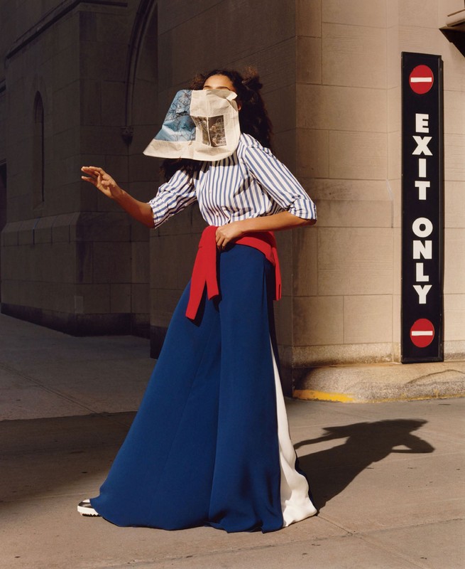
With "DNA Models," I looked at the shot with the blue pants (long skirt?) outfit with bright red belt/sweater, or whatever it is, tied around the waist. I'd say that these colors are easily within the capability of Portra film optically printed onto a professional RA-4 color paper. I'm making this judgment on the basis of knowing how a Portra photo of a "Macbeth ColorChecker" would print on such a system. And also knowing what sort of RGB pixel values that same color chart should have in the digital realm.
Explanation of my color eval: The ColorChecker red patch is fairly close to the red circles in the "Exit Only" sign in the sample image, and I know this is readily printable when enlarging Portra negs onto RA4 paper. Something else I did was to compare the color "saturation" in these reds, as well as in the red "belt." In all three cases the amount of saturation is similar. (I'm comparing in "color spaces," assuming that the sample image is in the space known as "sRGB.") The red belt visually appears like a weaker red, probably because it is a lighter shade, but the calculated saturation is still about the same. Further, the ColorChecker blue patch, although a different shade than the blue pants, has much stronger saturation. So bottom line, it seems easily within the capability of Portra optically printed onto RA4 paper, no trickery needed.
I'd say that he sure did in this case. In the outfit where I spent a lot of years - a large chain portrait outfit - this image, based on the skin tone, would have been way outside of our acceptable limits. I can understand why he might want to do this as an artistic call, trying to give a sunset sort of impression. But in our portrait chain, where images were intended to be sold to the customer, we wanted them closer to reality. A yellow skin tone like this would have been, at inspection after coming off the processing machine, immediately kicked back for a remake. If it somehow slipped past that, the "dust spotter," a person who uses dyes and an artist's brush to retouch dust spots on the prints, would have kicked it back for remake.
Anyway, I don't see anything in this image to indicate that it couldn't have originated as an optical print from Portra film.
thanks for the in-depth response! Ill look into RA4 Paper for my own work as I want to start printing this year! :)
-
If shooting for publication, I suspect the shots are digitally scanned. Going via a photo-paper print seems like a ridiculous route to a digital file for publication.
The (off-true) shot of the cottage has an obvious shadow of the photographer cast on its wall - schoolboy error! The shadow has been lightened to make it less obvious, but it's still there. I know from experience that removing such a shadow in darkroom printing is next to impossible, so I strongly suspect that digital manipulation was used.
Beside that, I see nothing remarkable about the technique used. Most were shot in late or early sunlight to give a yellow/orange cast and hard, long shadows. That's about it.
'shot of the cottage has an obvious shadow of the photographer cast on its wall - schoolboy error! ' - that is actually quite consistent in his work and I think its actually done on purpose like a signature - but again I'm not sure. Regardless a very talented photographer who I wish to learn from!
-
When you say he does his own printing, I'm sort of presuming that you mean optical printing, as with an enlarger. (This is where the so-called enlarger projects an image of the negative onto light-sensitive paper.) Is this correct?
When you are printing thusly, and assuming a reasonably normal light source (color-wise), there really is not much leeway for "pushing yellow" or that sort of thing. (I'm talking specifically about people pictures, with "proper" skin tones.) Anyone who has worked in a pro lab knows that there is a pretty narrow acceptable range for skin tones, although the tolerance is slightly greater in the direction of yellow. So I would guess that he is not going much outside of a normal range. In the (old-style) lingo of the business, we'd say that about 5 CC units of yellow is about as far as you can go. Pro labs would not normally go that far, except in the case of some particular studio owners, who for some reason like the color that way (the customer is not always right, but since they DO pay the bills...).
Now, if someone is shooting photos under a "non-standard light," mainly for its special effect, then it generally IS ok for skin tones to have a color bias. The viewer can see, perhaps unconsciously, that it is sunset, for example, and they therefore expect the skin to be a bit reddish or yellowish. (This is on the side of the face toward the sunset; the shadow side will be different as it is lit mainly by the bluish sky.)
Can you perhaps show a link to some specific images? Im not really seeing anything that I see as unusual.
As a note, the images that are being published in ads are most likely heavily worked over digitally. So they are not necessarily representative of how his own printing initially looked. Once you get into the digital world you can do all sorts of color "adjustments" that are not normally possible in the world of conventional optical printing.
Hi Bill,
Thanks for the reply -
Here is an example, I have no idea how he shot this - how did he achieve these colours and tones? It looks like golden hour but there are 6 looks / different locations etc..
Maybe it's not golden hour just arri lights and an editing technique?
here are some other good examples that best show his work and tones
https://yesassets.s3.amazonaws.com/map/cache/map-87763-w388.jpg
I would love to learn how these are made and how he shoots, I think his work is fantastic and would love to learn aspects from him!
Thanks
-
Hello,
A photographer I really like produces amazing work, shes called Elina Kechicheva - I was wondering if anyone knows the technique behind her work. LINK
The colours are so vivid its kind of like the autoschrome lumiere process but the highlights are never hit, the skin tones are always beautiful. It looks so dream like.. low contrasty images too. Looks very glassy ( if that's a good way to describe it )
It's not done with curves as they mess with the skin tones too much and make it too contrasty.
Any help would be great - thanks
-
Hello,
I'm new here to this forum but it looks like it has a big community!
I wanted to learn as much as possible about the technique of a British photographer called Jamie Hawksworth. He's really established and has a huge archive of work. [LINK]
These are the things I currently know about him..
He shoots Portra 400 with a MamyiaRZ67 or his Pentax 67 and does his own printing ( even on large commissions ). I've heard he pushes yellows in his printing process. He seems to have a really in-depth knowledge of printing.
I want to know how he shoots and how he consistently produce these colours.. I know he shoots during the golden hour but I have seen huge campaigns from him with 6+ images all with the same lighting.. how can you shoot 6+ images in an hour? ( with styling and make up etc )
Anyone here knows his tricks?
Thanks..
How is this image shot and edited?
in Portraits & Fashion
Posted
Hugo Comte on Instagram.
Looking to get an insight into this image and photographer in general.. would love to know how he shoots and edits.
Very on the nose with the early 90s imagery but I love his colour work.
Anyone have any ideas?
Thank you -