

patrick_foran
-
Posts
9 -
Joined
-
Last visited
Content Type
Profiles
Forums
Blogs
Events
Downloads
Gallery
Store
Posts posted by patrick_foran
-
-
<blockquote>
<p>I seem to have misunderstood the problem before, but I still do not think that Generic RGB profile has any place in most workflows. What does it look like if you assign sRGB? If it still looks wrong in that case, then the problem may be with whatever profile Preview thinks the monitor has.</p>
</blockquote>
<p>Hi Joe -- if I assign sRGB through Preview, it does not change the image at all (i.e. it still looks wrong). I'm trying this on several images now, and I hadn't even realized how dramatic the differences are. Setting the profile to Generic RGB via Preview for dark or silhouetted images brings back a <strong>ton</strong> of shadow detail and texture, almost what I would expect from a RAW file.<br /> <br /> I think you're on to something with the problem being "whatever profile Preview thinks the monitor has." How can I remedy that?<br /> <br /> Thanks so much for the help!</p>
-
<p>I can confirm that all of my images are displayed by default with Generic RGB. <br /> I have a Panasonic LX3 and a Canon XT. If I look in "Get Info" for the LX3 images, the listings are:<br /> Color Space: RGB<br /> Profile Name: sRGB IEC61966-2.1<br /> But when I open in Preview, choose "Tools > Assign Profile," it is already preset to "Generic RGB" in all instances.<br /> <br /> <strong>EDIT</strong> : Sorry, what I wrote above is incorrect. (I'm leaving it there in case it sheds some light on my confusion : ) Under "Tools > Assign Profile," "Generic RGB" is not actually set, it's just the first option that pops up. Actually, if I select Generic RGB and apply it, the image displays correctly! (i.e. not over-saturated, brings back shadow detail, reds and skin tones under control). This is how I want Preview to display the colors. How can I do this?<br /> <br /> Thanks everyone for your responses. This must be frustrating....I most likely just need to do some serious reading about color management when I have the time, rather than posting my problem and saying "please fix this!" ; )</p>
-
<p>Can anyone tell me, in the image I embedded in the original post, how to make Preview/iPhoto match the others? I'm still not sure. Even if this is not the "correct" thing to do, I would like to know simply to satisfy my own curiosity. Andrew, what you say in your second sentence is correct -- Preview/iPhoto/OSX is the app that is "either not using the display profile correctly or at all, or not recognizing the embedded profile," and therefore doesn't match. <br /> <br /> Maybe this is the best way to describe: if I see a photo on the web, <em>it displays correctly on my monitor</em> , but the moment I drag it to my desktop (and Preview gets hold of it), <em>the colors change completely.</em> I believe this is because OSX always uses the "Generic RGB Profile," which either strips out the original profile or inserts it where there was none. This is what I want to stop. Please, I am looking for a way to change the way OSX handles color profiles, not for advice on calibrating my monitor.<br /> <br /> Again, please, we are talking about precisely the same image, the exact same file, displaying differently in different applications. This will not be solved by calibrating the monitor. The advice I'm looking for will have to be something about the settings within OSX.<br /> <br /> Again, thanks for all of the help!</p>
-
<p>I suppose it's possible I will have to adjust the settings depending on whether I want to output for print or for web. As it is now, PS matches what I will see on the web, but it will probably look terrible printed. I'm okay with going back and forth, I just want to be able to see consistency in all applications.<br /> <br /> EDIT: yes, I definitely want to use the "display space" color across all applications, as 98% of my images are shared/viewed either online or on my monitor, so I want those two spaces to match each other. For the 2-3% of images that I print, I can save a different setting within Photoshop or keep a proof print around to match the printed colors. So this takes me back to the original problem: now that I've gotten PS to display correctly, how do I change OSX/Preview. I suspect it has something to do with the "Colorsync Utility," but I'm hesitant to go mucking around in there...<br /> <br /> Suggestions?</p>
-
<p>Hmmmm....you may be correct, as I have always thought that my printed images came out too dark and over-saturated already, even before I changed anything about the color handling in PS, so if PS is now showing me even lighter, less-saturated images, it seems I've changed it in the wrong direction. So if Preview/iPhoto/etc are displaying "correct" color, why are Firefox and Safari so far off? The reason I originally changed my PS setting was because images posted to any website looked completely bleached of color compared to both the original and what I had generated in PS.<br /> <br /> But there is also the problem that the colors seem "correct" in the web, rather than is OSX. For instance, in the image I posted above, it looks dead-on in both Safari and Firefox, perfect/reaistic skin tones, but if I grab that image and drag it to my desktop, the skin suddenly looks sunburned. <br /> <br /> ach.</p>
-
<p>To put it another way:<br>
It used to be the case for me that Safari/Firefox displayed the images correctly, but both Preview <strong>and</strong> Photoshop were over-saturating. I changed the Color Settings in Photoshop to "Monitor RGB - Color LCD Calibrated," and <em>poof</em> , it instantly displayed images with the same color as Safari/Firefox. How can I create a similar "poof" in OSX so it displays that same color?</p>
-
<p>Hey, thanks to everyone for these quick and highly detailed responses. I certainly have more to learn about color profiling. However, I have to agree that I still have the same difficulty as Peter Wang, and this is not solveable by calibrating the monitor, with or without a hardware calibrator. The thing is (and I also apologize for sounding like a broken record), my monitor already displays colors correctly. I don't want to change my monitor. In all third party software and all web browsers, my images look exactly right. Why do they look different in native OSX apps? This is what I want to change, how OSX native apps are displaying the color. We're talking about the same file looking different in different applications, so calibrating the monitor won't change how those individual apps read the color profile of the image. The image might look better, but the same amount of difference will still exist in the way different applications display it. <br /> <br /> <em>To put it more directly</em> : I need to change the way OSX handles color profiles, not the way my monitor displays color/gamma/etc.<br /> <br /> In the image I embedded above, <strong>I have not changed anything about the color profiles.</strong> I just learned that I could change the profiles in Preview, so I haven't been running around willy-nilly changing settings on anything. That is the exact same file displayed in four programs. Preview gets it wrong. Why is this? How can I change it? Calibrating the monitor will change how the Preview image looks, but it will make similar changes to the way the Safari/Firefox/Photoshop image looks, so they still won't match.<br /> <br /> If someone could tell me how to make Preview match Safari/Photoshop/Firefox, I would be grateful.<br /> <br /> Thanks again!<br /> Patrick</p>
-
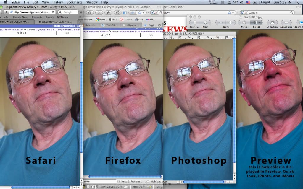
<p>I know various forms of this question have been asked elsewhere, and I've read many replies without finding a way to fix the issue. Hopefully I've outlined things thoroughly enough below that someone will read it and say, "Oh, of course you just need to....." : ) (I'm using a MBP with Leopard 10.5.7)<br /> <br /> The color of my photos is correct and consistent within Photoshop, Safari, and Firefox. However, when I view them in Preview/Quickview or iPhoto, they are very noticeably over-saturated and darker. This is true for images taken with both my cameras (a Panasonic and a Canon), images displayed on webpages, and images I save or download from the web. The same is true for video footage: once uploaded, my videos look correct and consistent on Safari and Firefox (in Vimeo, Flickr, Facebook, and Youtube), but always darker and more saturated in both Quickview and iMovie. I've inserted an image below that demonstrates the differences. <br /> <br /> There are two methods I've found that make images display with the correct color in Preview(etc), but each requires manually changing a setting and re-saving each image individually. How can I display the correct color without changing each individual image? The two methods are listed below:<br /> <br /> METHOD 1: If I open a photo in Preview, it is over-saturated. Looking under "Tools > Assign Color Profile," the default is set to "Generic RGB Profile." If I change this to "Display" or "Color LCD," the image looks perfect! How can I implement this system wide, so Preview always assigns the color profile "Display" or "Color LCD"?<br /> <br /> METHOD 2: Take an image that is over-saturated in Preview. When I open a photo in Photoshop, then save a JPEG with the "embed color profile" box checked, the resultant image will display correctly in Preview/Quicklook, etc. (actually it's still a little more saturated, but not nearly as much). So now the question is, how can I get OSX to recognize/embed/not strip out the color profiles from the start? I have about 45,000 digital images (adding more all the time) so clearly opening them each in PS and resaving them with embedded profiles is not an option. <br /> <br /> I've seen the same problem (sometimes with slight variations) posted elsewhere, and no one seems to be able to offer a solution. Can anyone provide a straightforward fix? Changing the color profile/gamma settings for the LCD does not work because, of course, if I get Preview/Quickview/iPhoto/iMovie to display correctly, then everything else looks wrong. There must be some internal OSX setting that controls the way these programs read and display color.<br /> <br /> Any help is appreciated!<br /> Patrick<br>
<img src="http://i722.photobucket.com/albums/ww221/icarusdive/color_compare_labels.jpg" alt="" /></p>
Color Profiles in Mac OXS
in The Digital Darkroom: Process, Technique & Printing
Posted