

andreas_manessinger
-
Posts
202 -
Joined
-
Last visited
Content Type
Profiles
Forums
Blogs
Events
Downloads
Gallery
Store
Image Comments posted by andreas_manessinger
-
-
Most winters I am interested in mountains. This year it's rivers :)
-

Could as well go under "Architecture", but as I was out for foliage
colors, I prefer to file it under "Nature" :)
-
That's a wonderful street scene and I really like the symmetry. In a way it still does not satisfy me though, at least not completely. I've just loaded it up in Photoshop so see what one could do, if a black background would help presentation, and I finally found that adding a simple white frame, just as the old paper images had, improves the image.
Try it for yourself: I just gave critique to an image where the frame played a crucial role, and this is again one of those rare cases where a frame adds substantially to an image. I tried a white frame, 35 pixels on each side, but changing it to black also works. Not as well, but it works.
Thinking about why this is, I came to the conclusion, that with the frame, the two people to the left and right come closer into the center. The composition gets more balanced. At the same time the vertically unbalanced window gets better tied in. The frame holds those disparate elements better together.
Anyway. I really like that image.
-
-
-
Oh dear, see my mistake? The rules say you must keep your shadow
out of the image, and what did I? A minute I let my attention slip and
somehow it must have sneaked into the image
-

This is an image from our trip to Poland. We just returned from
Auschwitz and made our way back to Kraków. The sun went down, and
when I saw the last red on the clouds, I simply had to stop and take
some images, regardless of subject. This is the result :)
-
Nice image. I like the lines going into the lower corners, and the bright spot in the upper right corner gives a strong sense of direction. Nice bokeh as well.
There are two things that I personally would do different: First is the upper left corner. I'd desaturate it mostly and darken it a bit. As it is, it pulls me out of the frame. The second thing is entirely subjective: I would increase saturation. After all, this is a man-made oject, no landscape. Even when we overshoot, nobody will notice, but the bronze/violet color contrast is really nice.
-

This is an HDR image made of four out of nine bracketed exposures.
HDR and tone mapping with Photomatix Pro.
-
-

Brilliant. I love the perspective. It contributes greatly to the atmosphere. Dark, morbid, gothic and beautiful.
Andreas
-
Yes, the top of the image does not contribute to the subject at all. From the top of the bush covering the left side of the bridge, there emerges a tree trunk. I'd crop down from the top, so that this tree is just not visible any more. I just have rated the image 5/4, and after the crop I'd definitively give it a 6/4. It's not very original, but, wow, what colors. I am also not troubled by the fact that you originally chose a vertical. Not seeing the whole, leaves place for imagination.
Being there I would really want to go nearer and go into all sorts of details, always trying to emphasize color complements, dominant lines, light and shadow. With all those curves and reflections from the water, this should be no problem. You could shoot a whole series of images at this fantastic location.
Andreas
-
Nice girls, so I count you a lucky guy :)
But maybe that's not what you're mainly interested in here. I like this image. It has a strong emphasis on the major diagonals, tonality is very appropriate for the subject, colors as well.
About the only thing I'd like to change if I could, is the position of the TV set. Having it about something between half and two thirds of its width to the left, would make the composition perfect. As it is, there is mo merger between the woman on top and the TV, but it is still very close for such a high contrast subject.
Having said all that, this is an amazing image, and not at all only for its very desirable subjecs. Great job.
Andreas
-

I shot this image in the morning on my way to work. In the morning, regardless of what way I choose, I mostly walk against the light, and all about light and shadow this is.
The title is from a song by XTC.
-
Juan,
What strikes me in this image is the very unconventional crop. It brings me right to the emotion. I don't know why, but it somehow accentuates the sadness in the face.
The next thing I like is the soft quality of light, and of course the colors are an exquisite match. I like your choice of aperture. The small depth of field helps to simplify the image and really brings out the face. And, at the same time, this is where I have a bit of a problem.
For me the eyes are the most important part of the image and I strongly feel that they should be in focus. Instead you seem to have focused on the nearest hairs. I think having the focus at the plain of the eyes and the mouth would have been even more effective.
Cheers, Andreas
PS: Be my guest at my photoblog :)
-
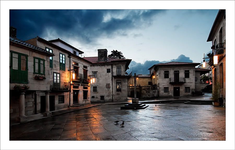
Hi Manuel,
What a great mood. I love how you have captured this early evening / after the rain feeeling, I love the color depth and how you have managed the contrast. Really beautiful.
In a perfect world I'd like to see the cross in the back of the square nearer (which I see no way to achieve without making this a totally different image), or at least better separate from the background. There would be two ways to get there. First, having lights in the background behind the cross, where it looks like a street leading off the square. Second, faking it in Photoshop. The first would have been quite impossible without a local contact, and even if you had it, you would most likely have missed the moment. This leaves you with Photoshop.
I have just tried it and it is fairly easy to do. Load the image in Photoshop, Paint Shop Pro, GIMP, or what ever you use. Add a new layer in blending mode "Soft Light", fill it with the neutral color 50% gray, select one of the bright, warm yellows from the walls and, with a soft brush and maybe 10% fill, paint over the background where you feel it would be lit. Don't worry about spilling into the cross and the walls you don't want to light up. Now add a mask and paint away where you don't want the added light. My result looks like this.
Again, this is a fine image with very effective use of the wide-angle lens. Care to tell us where it is?
Cheers, Andreas
PS: Be my guest at my photoblog :)
-
 Comments welcome


River Gail in Winter
in Landscape
Posted
This is a place I visited a few times this winter. It's great. The river is bi-forked here, one stream runs
through a power plant a few hundred meters south, and this is the overflow. They try to keep the
flow constant, thus water levels here vary much more than they otherwise would, and the river looks
different whenever I am there.