

kckong
-
Posts
24 -
Joined
-
Last visited
Content Type
Profiles
Forums
Blogs
Events
Downloads
Gallery
Store
Posts posted by kckong
-
-
D90 or D300
in Nikon
Wow loads of great advice here!
Just to share one more consideration - might you consider carrying 2 bodies (so you don't have to swap lenses) for wedding jobs? If yes, what combinations of bodies will you be comfortable with?
-
I would go with a wide angle zoom like a 12-24 or 10-20 or 11-16 or just a 17-50 kit lens + rear-curtained on-camera
flash. I think one of these lenses should fit your d40
<p>
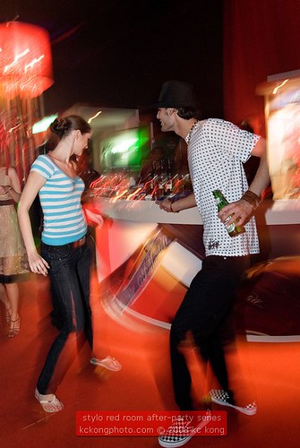
In a club setting, I'll expect there to be lots of flashing/swinging lights & that's where the beauty is. Set your aperture
small to get a sufficiently long shutter speed to capture the ambient & some motion blur in the bg. At the end of the
exposure the flash will illuminate your subject nicely ... oh I set my flash to manual power & use the GN formula to
estimate the power needed. You could just chimp :)
<p>
In the beginning, I was "advised" to get the fastest lens I could afford. Looking back, I think I was ill-advised. I burnt
a hole in my pocket & still got blur/noisy pictures with no "club" feel.
<p>
Oh the other thing is a short focal length / wide angle lens will come in very useful to give your images a wacky in-
your-face kinda look, which I think is most appropriate for clubbing imagery. Not to mention the usually cramped
quarters of a clubbing environment
<p>
HTH<br>
kc
<p>
<img src="http://farm3.static.flickr.com/2259/2349597498_a758e2dc0d.jpg">
-
That is so nice of you Patrick! God bless.
-
Oh, I forgot one thing. I'd like to know the actual camera-to-subject distance when using both combos. A visual
experiment will be very insightful, no?
-
David Bell, that sounds pretty logical. Why don't we run a live test on it?
Correct me if I'm wrong but we'd need to have someone with a fullframe body eg D3 or D700 and a 1.5x crop body
eg D200 / 300 etc.
Then we'd need, say a prime 90mm (say a Tamron SP macro?) to go on the crop body and a 135 (f2.8) on the
fullframe body.
Finally, I'd guess that we want to shoot a portrait of the same subject using both combos. Let's spec that
further - make a headshot portrait that fills the frame, no cropping in PP. Does that sound right?
LOL I'd do it if I had a fullframe body and a 135 ... but I don't. Any volunteers?
-
Ooops, so sorry to all for the formatting of the links in my previous post. The first two links work fine. The third one ie the one for down loading the action is <a href="http://weblog.slower.net/archives/3">http://weblog.slower.net/archives/3</a>
-
I'm also new to B&W conversions & had been using the channel mixer method. Recently I came across a "LAB" method by someone called Rob Carr <a href="http://www.designbyfire.com/?p=17" target="blank">here</a> and <a href="http://lifehacker.com/software//photoshop-black-and-white-conversion-032334.php" target="blank">here</a> and the steps were made into an action downloadable <a href="http://www.slower.net/slowerlog/2004/09/bw-conversion.php" target="blank">here</a>.
Why I use this method? LOL I don't really understand how it works but I thought I'd play with it a bit. I also process the original color file (eg fix color, contrast and levels to stretch out the histogram) before conversion.
When i used the channel mixer method, I used to have to "break" the r+g+b=100 rule a bit (somethimes up to 105 max). With this LAB method, I use a luminosity blend curve layer after conversion for a bit of pop at the highlight end.
I have 2 images done using this method in my gallery. As I'm new to conversions, I'll also appreciate feedback on this LAB method from anyone who is familiar with it.
Thanks & apologies to the thread starter (don't mean to hijack your thread, but you might like to explore this method too?)
-
Colton, I haven't seen one on this website before ......
..... but I've seen antlers in a chinese medicine shop before LOL nice to know they fall off naturally & regenerate, I thought they killed the deer to get the antlers :)
-
I shoot digital & I add that info during import into LR.
However, I noticed that when I create a web gallery in LR, the metadata gets lost :( Maybe I'm doing something wrong *scratch head*
-
LOL thank you Steve ... though the 3 upstanding ones on the left still look like elephants' tusks to me LOL
-
Thank you Patrick ... it works for me now :)
In Lightroom, I can switch on that visual warning by clicking the highlight & shadow squares in the histogram window ie no need to hold down the Alt key ... but I can't find the same thing in CS2 ... so it's good to know this Alt key feature :)
I can see why you use it ... it's easier to see compared to guessing whether the histogram has clipped & you know where the clipping is happening too
-
IMHO the light and shadow on the tree and the deer are inconsistent. The strong shadows on the tree suggest harsh
light from slightly behind camera right,. But the right side of the deer is darker than the back left which shows a hint
of backlighting.
That's a big hint that the deer is transplanted. Unless the tusks (horns?) beside the tree have been artificially lighted
Strobist style :)
Maybe you can find a deer image with matching light?
HTH
-
This is an interesting thread :) Patrick, I've never used the Alt key for the purpose that you mention. I've just tried it in LR1.3.1 and CS2 but I can't see any difference in the screens other than some of the buttons showing "Reset". Is it supposed to do something else? Or perhaps I need to set some preferences in LR and CS2 to make it work the way you mention?
Thanks.
-
Ellis & Patrick, thanks for your feedback. Before setting out on this adventure, I looked at some examples of B&W
portraiture on the net ... that's how I chose the 3 issues mentioned as my yardsticks.
<p>
Ellis, you said "a little flat in the midtones with no real sense of highlights". Could you elaborate on that please? Did
you mean you'd like to see more highlights or less? About the midtones, I take it you'd like to see more variation in
tones for example in the older boy's legs and on the shadow side of their faces? Apologies for being so pesky ... I'd
like to really understand the finer points of B&W
<p>Patrick, I will definitely try a landscape conversion one of these days... I'll message you for your comments then.
Though it seems a bit challenging ... and hints of studying the legendary AA & his zone thingy which I find rather
heavy :)
<p>
By the way, I don't know if I was fortunate but I bumped into an <a
href="http://www.nga.gov.au/Exhibition/KarshShmith/Default.cfm?MnuID=6" target="blank">essay / commentary on
Youssuf Karsh</a>'s high-contrast(?) style and the author had also shown some work by an Australian photog Athol
Shmith. I thought Shmith's style was quite different (though I can't put my finger on it). Here are links to two portraits
of Sir Laurence Olivier done by <a href="http://www.nga.gov.au/Exhibition/KarshShmith/Detail.cfm?
IRN=49583&MnuID=1" target="blank">Karsh</a> and <a
href="http://www.nga.gov.au/Exhibition/KarshShmith/Detail.cfm?IRN=107516&MnuID=1" target="blank">Shmith</a>.
Could you share some thoughts on these 2 portraits/styles?
<p>Thanks
<br>kc
-
I 'm new here (though I had registered some time back) and this is my first post in the forums. I hope I've posted this
in the right place.
<p>I have been fiddling with numerous methods for converting digital color images to B&W in PS CS2 ... including
desaturation, greyscale and channel mixer, Recently I came across a method by Rob Carr which had been captured
as <a href="http://lifehacker.com/software//photoshop-black-and-white-conversion-032334.php">an action for PS
CS2</a>
<p>As this is my first serious attempt, I hope to get some feedback on how I've done. Particularly I'd appreciate
feedback on these issues ... too bright or too dark? too contrasty or too muddy? too sharp or too soft?
<p>I'll also be grateful if anyone out there could share their experience in using this method
<p>thanks,
<br>kc
<img src="http://d6d2h4gfvy8t8.cloudfront.net/7593816-lg.jpg">
<br>
PS: I uploaded this image to my gallery but I couldn't find the button that reveals its URL... I hope it works
-
Hi, I'm researching B&W portraiture & came into this thread to find out more about Karsh's lighting.
Thanks to Brooks sharing his first-hand info, I now know the reasons for the high contrast and hard shadows I saw in
his portraiture. I was looking for samples of B&W portraiture to model my conversions from digital color images and I
had stumbled upon an exhibition of his work on the National Gallery of Australia's website
(http://www.nga.gov.au/Exhibition/KarshShmith/Default.cfm?mystartrow=13&realstartrow=13&MnuID=3)
If you follow that link, don't forget to read the Peter Adams essay where Adams talks about Karsh's work in
comparison to Australian Athol Shmith's. It'd be interesting to hear what you think about his comments on both
men's portraits of Sir Laurence Olivier (or would it be better if I start a new thread ?)
Thanks again Brooks
"Instant JPEG from Raw" from rawworkflow.com and Imagenomic
in The Digital Darkroom: Process, Technique & Printing
Posted