

wasteland
-
Posts
17 -
Joined
-
Last visited
Content Type
Profiles
Forums
Blogs
Events
Downloads
Gallery
Store
Image Comments posted by wasteland
-
-
May I suggest the caption, "Flea Market, Miami" for this photo? The less a picture is specificized the stronger is the impact (except, of course, for newspaper pics, which this is not).
Also, to Jan Leathem: if the negative comments are inexplicable, so are the positive comments. We are expressing our opinions, and they need not always be complementary. If we cannot honestly critique art then this forum, and many others, would cease to exist. Further, the ability to compare the quality of works of art is fundamental to the appreciation of art -- it actually enriches the artistic experience, rather than devalue it.
I do agree with Marc G. that "Love at Maxim's" is a lovely picture. Also "Outside a LA Strip Club" (though slightly stereotyped without the caption), "Sunday Morning" and "Night Swimmer".
-
This photo is a street photo pure and simple -- so far so good. But no photo is good just because it falls in some interesting genre -- architecture, candid, portrait, nature, street whatever. A photo is good because of a) aesthetics and b) context/connotation.
This photo doesn't have high aesthetic value. As has been pointed out, it is cramped, cluttered and probably shot from the wrong angle (how about a little further down and a little further away?) So does it redeem itself in context? A bit, yes -- it's an interesting subject in an interesting locality. But not enough to compensate sufficiently for a bad shot.
I strongly disagree with those who claim that the point of street photography is merely as a document of life. Great street shots are art, and as art they must be judged by the standards of art. Yes, a series of photos might be stronger than an isolated image, but the strength comes from the sense of completeness/narrative in the presentation, and it is an artistic strength. It doesn't make the individual photo better.
-
> The aspect ratio suggests cropping, likely the right side to
> exclude distracting elements.I don't the pic is cropped -- it's 504 by 325 pixels, which gives approx. a 1.55 aspect ratio, more or less equal to the 1.5 aspect ratio of 35mm film. ?
Cheers
Sid -
Ummm... I quite agree it's very difficult to compose effectively when shooting "from the hip", as it were. But there can be no doubt that the finest street shots, by HCB, or Kertesz, or Winogrand, or (of the ones I've seen on this site) MacEachern have a compositional unity about them that is very pleasing. Yes, the difficulty in even framing the subject on the street pushes the ratings of a picture higher (and in extreme cases, like Capa's war pictures, we're ready to overlook almost anything), but for most pictures to be truly "classics", as many photo.netters have dubbed this one, they must, through luck or skill or whatever, be extra well balanced.
I remember that last week's PoW, although not a very good picture per se, was exalted because it was ingeniously shot. Aren't you guys coming up with the same argument here? You're saying the picture is great because it's so difficult to shoot it. This subject hardly poses the levels of difficulty that would truly transcend all other criteria.
It's a fine shot indeed, and again, I really love candid B/W's and try to do some street shooting myself, but I wouldn't call this a classic. Good photo yes. Slice of life yes. Classic no.
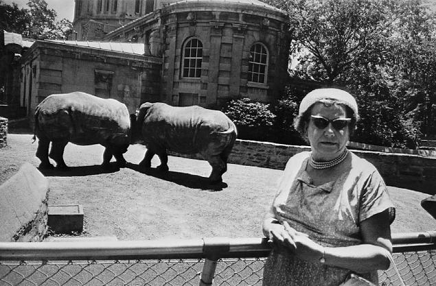
> Those glasses (much more interesting than the Winogrand
> attachment/hippo shot- which give no insight of the lady
> in the pic, compared to this one)Oh please Michael :). Exactly what "insight" does HCB's man jumping over a puddle pic give you? Winogrand exploits the resonance between the specs and the rhinos (not hippos) to convey a huge amount about the lady and about the world as he sees it. It's satire at its best, and a street photog truly becomes great when he can express _him/herself_ through a candid, unmanipulated slice-of-life shot. It's possible -- HCB did, for one.
Cheers
Sid -
First, congratulations to Marc fo the PoW.
I think Douglas K. puts it very well. This photo, although of an interesting subject and shot with an interestingly wide lens, does not really have very much going for it compositionally. First, it's too cramped, and even then the figure seems to be a little too much to the right. And the whole thing seems to be squashed horizontally and has no clear compositional lines delineating it. Second, there's not enough separation of background and foreground, so the good variation in intensities (I love the hat and the scarf) is underused.
So although I am very fond of B/W candid street shots, I think we tend to get carried away by the human aspect and the B/W (soooooo classic!). Just like people liked the lovely colours and delicate frost patterns of the last PoW, although it had very little meaning as a photograph (spare me the "wonders of nature" eulogy :)).
Incidentally, this (attached, and URL below) is the best "big glasses" photo I've seen -- note that this photo addresses both the issues above, and has a lovely economy of expression :)
http://www.coldbacon.com/pics/winogrand/winogrand-rhinos.jpg
Cheers
Sid
-

Rod, if you are applying physics here, I will recommend you for the Nobel. Are you seriously telling us that you can predict how two birds flapping around will scatter snow?
And if you still insist on a "rational" explanation, then for starters, the bird in the air is moving faster than 1/500 sec can freeze it (stop a while and think how fast that is) -- I would expect it to be shedding/scattering a lot of snow -- while the bird on the ground is comparatively stationary.
When there's a reasonable, non-PS explanation for everything -- the size disparity, the shadows, the snow -- why the hell don't you take the photographer at his word?
Truth can be stranger than fiction, and this isn't even strange. If you guys haven't learnt by now that patterns in nature can appear unusual when projected in 2D (that includes our eyes), then you haven't learnt to see yet -- how on earth do you take your own photos? By your logic, every one of HCB's pictures is photoshopped -- no really, I have convincing "evidence" to prove it. The same goes for Adams, Kertesz, Bischof et al.
I agree with Murray -- no photog would _want_ to get a POW.
-
I like the juxtaposition of different stories in the background and the foreground. The butterfly (?) on her hand adds to the fantasy element in the fg, in sharp contrast to the real and mundane scene captured in the bg. This must be a well-worked artistic theme -- the child's world existing both inside and outside the adult world. Beautiful picture. The only distracting thing is that slight crop of the hair and perhaps a tad too much blue space on the left, but I'm nitpicking.
-

I'm pretty sure her lip isn't pierced -- if you look at the colour picture, which is posed slightly differently, the mirror has that white spot in exactly the same place (look at it's position relative to the vermilion streaks), but it's just below the chin of the reflection there.
And while this is a technically superb picture and the reflection is indeed lovely, I must admit it doesn't evoke anything in my mind. It's a great portrait and the model must have been delighted, but all this ageing/time/revisiting stuff just doesn't strike me -- it's a bit too contrived (and perhaps the model herself is too unblemished) for that.
-
> Add reflections to a computer game graphics and you better be
> having major memory to handle that...these cameras are currently
> 6 megs?
Paul, LOL... reflections screw up game graphics engines because they're difficult to _generate_ from scene data, NOT because they're any more difficult to record as an image.
I suspect the "black windows" you refer to are due to something completely unrelated to the digital sensor -- some sort of polarizer maybe, or the angle of the incident light?
-
Poster behind the sculpture?
I thought that made the picture doubly humorous and suggestive by mimicking the real women.
And is it a poster?
-
So which flag were you trying for? India, Niger, Ireland, Cote d'Ivoire...? From your name I'd guess the first, but I shouldn't jump to conclusions. Or is the whole thing just a coincidence?
-
 I agree with Alkas. Excellent treatment of a hackneyed subject, and one of the few that attempt to go beyond kids for kids' sake. There's a sense of... ummm... maturity... that is heightened by the forward/sideways tilt of the head and eyes, the smile (as if the photo has been taken mid-sentence), the expressive hand, the winged chair. There are so many puns here... the kid as the jovial boss, the chair back suggesting wings (and thus satirizing the overworked "cute little cupid" theme), the blocks (as if the whole thing was a psychology experiment)... even the bib is suggestive. This is an absolutely excellent photograph -- I like it as much as 1/500, though of course the latter is a very different sort of photo.
 -

Ummm... as Mark Hobson said, the humans all seem to have been artificially created with Poser. So the only real thing left is... the tree. NOW is it a photograph?
Don't get me wrong, it's interesting artistically and I respect mixed media and all that. But shouldn't there be a certain minimum level of photographic content in an image for it to be called a photograph?
Basically, if you stick the Mona Lisa on your bonnet, your car may look better, but it's still a car, not a painting.
-
Lovely shot... and yes, the darkened background works wonders. Those white specks to the left are rather distracting, though. I don't normally like too much Photoshop work, but a bit of touching up there might be justified for a final presentation in this case.
-


"Dressing Well on a Flea Market Budget", Miami
in Uncategorized
Posted
> then perfect composition might or might not be desidered.
Perfect composition is, IMHO, always desired. It may not be possible, but you can't take away its desirability. Also, "perfect" composition is not necessarily static or rigid composition. It can be very fluid and fluent -- and there are countless examples from the masters to prove this.
> I prefer not to do perfect shots but rather to have them
> a little dirt but a little more personal
I hope you will not mind this, Giuseppe, but that's a great excuse for bad photography and is apt to be misinterpreted. Are you saying you purposely take a bad shot? Of course not. So I assume you're saying, you like to keep the composition informal. No problems there. But informal composition is not absence of composition!Photo.net portfolios aren't necessarily representative of the owner's photographic interests (at least half of mine was a temporary measure to show travel photos to friends and family and I've been too lazy to take them off, and lack of a scanner forces me to keep lots of stuff to myself, not that I'm much good as a photog).
In good faith
Sid